Sparkify is a fictional music-streaming company, and in this notebook, I'm going to analyze Sparkify's streaming data to predict customers that are likely to churn. Udacity provided two separate datasets, a mini-version (128MB), which was used in this notebook, and a larger version (12GB), which was used in an AWS EMR cluster.
Check out the accompanying Medium Article (linked in my Github Repo) for a write up and reflection!
Background
One of the most important concerns for companies with subscription-based business models is customer churn. Customers downgrade or discontinue service for various reasons, and the service provider often cannot know when or why customers leave until they leave!
If we can reliably predict whether a customer is likely to churn, we have the chance to retain these customers by intervening with promotions, communicating new features, etc. This is a proactive approach to retaining customers, as opposed to a reactive approach of getting back lost customers.
Importing Libraries & Data
import pandas as pd
import matplotlib.pyplot as plt
%matplotlib inline
import seaborn as sns
import numpy as np

from pyspark.sql import SparkSession, Window
from pyspark.sql.functions import count, col, udf, desc, max as Fmax, lag, struct, date_add, sum as Fsum, \
                        datediff, date_trunc, row_number, when, coalesce, avg as Favg
from pyspark.sql.types import IntegerType, DateType

from pyspark.ml.classification import LogisticRegression, GBTClassifier, RandomForestClassifier
from pyspark.ml.evaluation import MulticlassClassificationEvaluator
from pyspark.ml.feature import StandardScaler, StringIndexer, VectorAssembler
from pyspark.ml.tuning import CrossValidator, ParamGridBuilder

import datetime
# Creating a Spark Session
spark = SparkSession \
    .builder \
    .appName("Sparkify") \
    .getOrCreate()
df = spark.read.json('mini_sparkify_event_data.json')
Exploratory Data Analysis & Initial Feature Engineering
def shape_ps_df(df):
    '''
    Print shape of PySpark DataFrame
    '''
    print(f'DF Shape: ({df.count()},{len(df.columns)})')
shape_ps_df(df)
df.printSchema()
df.take(1)
Taking a look at the contents of a few columns...
df.select('level').dropDuplicates().show()
df.select('status').dropDuplicates().show()
df.groupBy('page').agg(count(col('userId')).alias('count_visits')).show(25)
Seems like Cancellation Confirmation and Downgrade are good indicators of churn.
# Taking a look at the userIds
df.select('userId').sort('userId').dropDuplicates().show(10)
# Dropping the blank userIds
df = df.where(col('userId')!='')
Exploring Location Data
# Taking a look at location
df.select('location').sort('location').dropDuplicates().take(10)
# Location roughly looks like we may be able to parse the state by taking the last two character strings
get_state = udf(lambda x: x[-2:])
df = df.withColumn('state',get_state(col('location')))
df.select('state').dropDuplicates().count()
# Listens by state
df.filter(col('page')=='NextSong') \
    .groupBy('state') \
    .agg(count('userId').alias('count')) \
    .sort(desc('count')) \
    .show(40)
# Unique users
df.select(['userId']).dropDuplicates().count()
# Unique users by state
df.filter(col('page')=='NextSong') \
    .dropDuplicates(['userId']) \
    .groupBy('state') \
    .agg(count('userId').alias('count')) \
    .sort(desc('count')) \
    .show(40)
Looks like most of Sparkify's listeners live in California, and we don't have all 50 states represented.
Exploring Date Data
Now feature engineering more granularity from the timestamp column.
# Defining some functions to help pull hour, day, month, and year
get_hour = udf(lambda x: datetime.datetime.fromtimestamp(x/1000).hour,IntegerType())
get_day = udf(lambda x: datetime.datetime.fromtimestamp(x/1000).day,IntegerType())
get_month = udf(lambda x: datetime.datetime.fromtimestamp(x/1000).month,IntegerType())
get_year = udf(lambda x: datetime.datetime.fromtimestamp(x/1000).year,IntegerType())
# Creating the columns
df = df \
    .withColumn('hour',get_hour(col('ts'))) \
    .withColumn('day',get_day(col('ts'))) \
    .withColumn('month',get_month(col('ts'))) \
    .withColumn('year',get_year(col('ts')))
df.take(1)
# Also creating a feature with the PySpark DateType() just in case
get_date = udf(lambda x: datetime.datetime.fromtimestamp(x/1000),DateType())
df = df.withColumn('date',get_date(col('ts')))
df.take(1)
# Now aggregating by date data my hour to see if there are any trends.
df.filter(col('page')=='NextSong').groupBy('hour').agg(count('userId')).sort('hour').show(25)
# Aggregating again by day
df.filter(col('page')=='NextSong').groupBy('day').agg(count('userId')).sort('day').show(32)
# By Month
df.filter(col('page')=='NextSong').groupBy('month').agg(count('userId')).sort('month').show()
# By Year
df.filter(col('page')=='NextSong').groupBy('year').agg(count('userId')).sort('year').show()
# Transferring the above date analysis onto a Pandas DF
df_pd = df.filter(col('page')=='NextSong').select(['hour','day','month','userId']).toPandas()
df_pd.head()
plt.figure(figsize=(16,4))

plt.subplot(131)
sns.countplot(x='hour',data=df_pd)
plt.title('Events by Hour')

plt.subplot(132)
sns.countplot(x='day',data=df_pd)
plt.title('Events by Day')

plt.subplot(133)
sns.countplot(x='month',data=df_pd)
plt.title('Events by Month')

plt.tight_layout()

Looks like we only have data from 2018 from the smaller dataset.
Looking at User Behavior
Making a days with consecutive listens feature
It may be useful to keep a running tally of consecutive days a user listens to a song.
# Creating a column containing 1 if the event was a "NextSong" page visit or 0 otherwise
listen_flag = udf(lambda x: 1 if x=='NextSong' else 0, IntegerType())
df = df.withColumn('listen_flag',listen_flag('page'))
df.take(1)
# Creating a second table where I will create this feature, then join it back to the main table later
df_listen_day = df.select(['userId','date','listen_flag']) \
                .groupBy(['userId','date']) \
                .agg(Fmax('listen_flag')).alias('listen_flag').sort(['userId','date'])
df_listen_day.show(10)
# Defining a window partitioned by User and ordered by date
window = Window \
        .partitionBy('userId') \
        .orderBy(col('date'))

# Using the above defined window and a lag function to create a previous day column
df_listen_day = df_listen_day \
                    .withColumn('prev_day',lag(col('date')) \
                    .over(window))
df_listen_day.show()
# Creating a udf to compare one date to another
def compare_date_cols(x,y):
    '''
    Compares x to y. Returns 1 if different
    '''
    if x != y:
        return 0
    else:
        return 1
date_group = udf(compare_date_cols, IntegerType())

# Creating another window partitioned by userId and ordered by date
windowval = (Window.partitionBy('userId').orderBy('date')
             .rangeBetween(Window.unboundedPreceding, 0))

df_listen_day = df_listen_day \
                        .withColumn( \
                            'date_group',
                             date_group(col('date'), date_add(col('prev_day'),1)) \
                                    # The above line checks if current day and previous day +1 day are equivalent
                                        # If They are equivalent (i.e. consecutive days), return 1
                            ) \
                        .withColumn( \
                             'days_consec_listen',
                             Fsum('date_group').over(windowval)) \
                        .select(['userId','date','days_consec_listen'])
                                    # The above lines calculate a running total summing consecutive listens
# Joining this intermediary table back into the original DataFrame
df = df.join(other=df_listen_day,on=['userId','date'],how='left')
shape_ps_df(df)
df.where(col('page')=='NextSong') \
    .select(['userId','date','days_consec_listen']) \
    .sort(['userId','date']) \
    .dropDuplicates(['userId','date']) \
    .show()
Making a days since last listen feature
It my also be useful to use this to measure inactivity.
# Isolating a few columns and taking the max aggregation to effectively remove duplicates
df_listen_day = df.select(['userId','date','listen_flag']) \
                .groupBy(['userId','date']) \
                .agg(Fmax('listen_flag')).alias('listen_flag').sort(['userId','date'])
df_listen_day.show()
# Re-stating the window
windowval = Window.partitionBy('userId').orderBy('date')

# Calculate difference (via datediff) between current date and previous date (taken with lag), and filling na's with 0
df_last_listen = df_listen_day.withColumn('days_since_last_listen',
                                            datediff(col('date'),lag(col('date')).over(windowval))) \
                            .fillna(0,subset=['days_since_last_listen']) \
                            .select(['userId','date','days_since_last_listen'])
# Joining back results
df = df.join(df_last_listen,on=['userId','date'],how='left')
df.take(1)
Running Listens By Month
Listens by month can also be a useful indicator of consistent user activity.
# Defining Window
windowval = Window.partitionBy('userId').orderBy(date_trunc('month',col('date')))

# Creating separate intermediary DF. Using row_number() on each listen within each month to count monthly listens
df_running_listens = df \
                    .where(col('listen_flag')==1) \
                    .withColumn('running_listens_mon',row_number().over(windowval)) \
                    .select(['userId','ts','running_listens_mon','date'])
# Joining back into main DF
df = df.join(df_running_listens.select(['userId','ts','running_listens_mon']),
                                       on=['userId','ts'],how='left')
df.select(['userId','date','page','running_listens_mon']).sort(['userId','ts']).show()
Dealing with Missing Values in running monthly listens
This method creates a lot of null values. Let's see how many nulls we have...
df.where(col('running_listens_mon').isNull()).count()
# Sorting by userId and timestamp
df = df.sort(['userId','ts'])
# Creating a window partitioned by userId and ordered by timestamp
windowval = Window.partitionBy(col('userId')).orderBy(col('ts'))

# Creating a lag of the new running listens column
running_listens_lag = lag(df['running_listens_mon']).over(windowval)
# When a null value is found, fill it with the previous value.
    # This effectively frontfills null values with valid values that immediately precede it
df = df.withColumn('running_listens_mon_fill',
              when(col('running_listens_mon').isNull(),running_listens_lag) \
                .otherwise(col('running_listens_mon')))
# Recounting nulls
df.where(col('running_listens_mon_fill').isNull()).count()
Still have null values that have to be filled. Re-running the lag as a loop.
n_null = df.where(col('running_listens_mon_fill').isNull()).count()
n_null
i = 0
while n_null > 0:
    # Re-creating a lag column based on the filled values
    running_listens_lag = lag(df['running_listens_mon_fill']).over(windowval)

    # Replacing 'running_listens_mon_fill' with new filled values
    df = df.withColumn('running_listens_mon_fill',
                  when(col('running_listens_mon_fill').isNull(),running_listens_lag) \
                    .otherwise(col('running_listens_mon_fill')))

    n_null = df.where(col('running_listens_mon_fill').isNull()).count()
    i += 1
    print(f'Loop {i}\nNull values left: {n_null}')

    if i > 5:
        print('Breaking loop to save computation time. Filling remaining null values with 0.')
        df = df.fillna(0,subset=['running_listens_mon_fill'])

print(f'Done.\nNumber of null values remaining: {n_null}')
Flagging Based on Other Page Values
# Creating udf's to flag whenever a user visits each particular page
thU_flag = udf(lambda x: 1 if x=='Thumbs Up' else 0, IntegerType())
thD_flag = udf(lambda x: 1 if x=='Thumbs Down' else 0, IntegerType())
err_flag = udf(lambda x: 1 if x=='Error' else 0, IntegerType())
addP_flag = udf(lambda x: 1 if x=='Add to Playlist' else 0, IntegerType())
addF_flag = udf(lambda x: 1 if x=='Add Friend' else 0, IntegerType())
# Creating the flag columns
df = df.withColumn('thU_flag',thU_flag('page')) \
        .withColumn('thD_flag',thD_flag('page')) \
        .withColumn('err_flag',err_flag('page')) \
        .withColumn('addP_flag',addP_flag('page')) \
        .withColumn('addF_flag',addF_flag('page'))
Defining Churn
I will consider a page visit to Cancellation Confirmation or Downgrade churn, which will be denoted by 1 in a Churn column.
def label_churn(x):
    '''
    INPUT
    x: Page

    OUTPUT
    Returns 1 if an instance of Churn, else returns 0
    '''
    if x=='Cancellation Confirmation':
        return 1
    elif x=='Downgrade':
        return 1
    else:
        return 0

# Creating udf
udf_label_churn = udf(label_churn, IntegerType())
# Creating column
df = df.withColumn('Churn',udf_label_churn(col('page')))
# Looking at average of the running listens per month by churn
df.groupBy('Churn').agg(Favg(col('running_listens_mon'))).show()
Calculating User Aggregations
Using the features I engineered above, I'll aggregate these for each user.
- For the metrics I calculated using Window functions (i.e.
running_listens_monordays_consec_listen), I'm taking the max- These represent most listens in one month and most consecutive days spent listening to music respectively
- For the flag metrics (i.e.
listen_flagorthU_flag), I'm taking the total sum- These represent total listens and total thumbs ups respectively
df_listens_user = df.groupBy('userId') \
            .agg(Fmax(col('running_listens_mon_fill')).alias('most_listens_one_month'),
                 Fmax(col('days_since_last_listen')).alias('most_days_since_last_listen'),
                 Fmax(col('days_consec_listen')).alias('most_days_consec_listen'),
                 Fsum(col('listen_flag')).alias('total_listens'),
                 Fsum(col('thU_flag')).alias('total_thumbsU'),
                 Fsum(col('thD_flag')).alias('total_thumbsD'),
                 Fsum(col('err_flag')).alias('total_err'),
                 Fsum(col('addP_flag')).alias('total_add_pl'),
                 Fsum(col('addF_flag')).alias('total_add_fr')
                )
df_listens_user.show(5)
Looking At User Session Data
Another potentially useful indicator is the extent to which users behave within each session. Below I'm first taking the total sum of each flag behavior (i.e. listen_flag) within each session.
df_sess = df.select(['userId','sessionId','listen_flag','thU_flag','thD_flag','err_flag','addP_flag','addF_flag']) \
            .groupBy(['userId','sessionId']) \
            .agg(Fsum(col('listen_flag')).alias('sess_listens'),
                 Fsum(col('thU_flag')).alias('sess_thU'),
                 Fsum(col('thD_flag')).alias('sess_thD'),
                 Fsum(col('err_flag')).alias('sess_err'),
                 Fsum(col('addP_flag')).alias('sess_addP'),
                 Fsum(col('addF_flag')).alias('sess_addF'))
df_sess.show()
Now I'm taking the average over all each user's session to get a sense of how a user tends to behave in one session.
df_sess_agg = df_sess.groupBy('userId') \
                .agg(Favg(col('sess_listens')).alias('avg_sess_listens'),
                    Favg(col('sess_thU')).alias('avg_sess_thU'),
                    Favg(col('sess_thD')).alias('avg_sess_thD'),
                    Favg(col('sess_err')).alias('avg_sess_err'),
                    Favg(col('sess_addP')).alias('avg_sess_addP'),
                    Favg(col('sess_addF')).alias('avg_sess_addF'))
df_sess_agg.show()
I'm going to take the approach of creating a user-metric matrix (users by calculated metrics) and using this as the basis for training and predicting churn rather than using the original provided transactional streaming data.
I believe this is a good approach to this problem since this heavily simplifies the training and prediction process. If this were to be implemented in practice, a streaming pipeline would be required to feed into the user-metric matrix, and a model would predict churn from this matrix.
dfUserMatrix = df.groupBy('userId').agg(Fmax(col('gender')).alias('gender')
                                             ,Fmax(col('churn')).alias('churn'))
# Note the heavy class imbalance
dfUserMatrix.groupBy('churn').agg(count('*')).show()
dfUserMatrix = dfUserMatrix.join(df_listens_user,['userId']).join(df_sess_agg,['userId'])
shape_ps_df(dfUserMatrix)
dfUMpd = dfUserMatrix.toPandas()
dfUMpd.head(2)
fields = ['avg_sess_listens',
          'avg_sess_thU',
          'avg_sess_thD',
          'avg_sess_err',
          'avg_sess_addP',
          'avg_sess_addF',
          'most_days_since_last_listen',
          'most_days_consec_listen']
aggs = ['mean','std']
agg_dict = {k:agg for k,agg in zip(fields,[aggs]*len(fields))}
agg_dict
dfUM_agged = dfUMpd.groupby('churn').agg(agg_dict)
dfUM_agged
# Accessing mean values and storing them as tuples with label as first element in tuple
means = []
for i in dfUM_agged.index.values:
    for field in fields:
        means.append((i,dfUM_agged.iloc[i][field]['mean']))
# Example of the means list
means[:2]
dfUMpd.head()
# Clearly we have many more churned users than non-churned users
plt.figure(figsize=(8,5))
sns.countplot(x='churn',hue='gender', data=dfUMpd)
plt.title('Churned vs Non-Churned Users')
plt.ylabel('Count')
plt.xlabel('Churn')
plt.xticks([0,1],['No','Yes'])
plt.show()

# Plotting average activity per session for each group
y_churn = [x[1] for x in means if x[0]==1]
y_nochurn = [x[1] for x in means if x[0]==0]

x = fields
N = len(fields)
ind = np.arange(N)
width = 0.35

plt.figure(figsize=(15,10))
plt.bar(ind, y_churn, width, label='Churn')
plt.bar(ind+width, y_nochurn, width, label='No Churn')

plt.ylabel('Average')
plt.title('Comparing Churned users to Non-Churned Users')
plt.xticks(ind+width/2, fields, rotation=20)
plt.legend(loc='best')
plt.show()

Prepping Data For Model
PySpark requires the data to be stored in a very particular format.
- It needs numbers only
- All features are in one column in vector format
- All labels are in their own column
Here's where I'll set all that up...
# Indexing gender to turn a categorical feature into a binary feature
gender_indexer = StringIndexer(inputCol='gender',outputCol='gender_indexed')
fitted_gender_indexer = gender_indexer.fit(dfUserMatrix)
dfModel = fitted_gender_indexer.transform(dfUserMatrix)
dfModel.printSchema()
# Defining the that we want to vectorize in a list
features = [col for col in dfModel.columns if col not in ('userId','gender','churn')]
# Vectorizing the features
assembler = VectorAssembler(inputCols=features,
                            outputCol='features')
dfModelVec = assembler.transform(dfModel)
dfModelVec = dfModelVec.select(col('features'),col('Churn').alias('label'))
Modeling
It may not be necessary to scale features based on the chosen algorithm. Tree-based algorithms are not sensitive to the scale of the features. However, algorithms like SVC and Logistic Regression perform poorly when features widely differ in scale.
I know I'd like to try Logistic Regression, so I'll standardize features here.
# Scaling to mean 0 and unit std dev
scaler = StandardScaler(inputCol='features', outputCol='features_scaled', withMean=True, withStd=True)
scalerModel = scaler.fit(dfModelVec)
dfModelVecScaled = scalerModel.transform(dfModelVec)
dfMain = dfModelVecScaled.select(col('features_scaled').alias('features'),col('label'))
# Train/Test split - 80% train and 20% test
df_train, df_test = dfMain.randomSplit([0.8,0.2], seed=42)
Given the class imbalance in the dataset (many more churned users than non-churned users) and simple binary classification, I decided to use accuracy and f-1 score because they're easy to interpret. Accuracy describes how often our model is correct regardless of the type of errors it makes, and F-1 score balances the tradeoff between precision (how often is the model correct over every "positive" prediction) and recall (how many of the total "positive" instances were identified correctly).
def train_eval(model,df_train=df_train, df_test=df_test):
    '''
    Used to train and evaluate a SparkML model based on accuracy and f-1 score

    INPUT
    model: ML Model to train
    df_train: DataFrame with data

    OUTPUT
    None
    '''
    print(f'Training {model}...')
    # Instantiating Evaluators
    acc_evaluator = MulticlassClassificationEvaluator(metricName='accuracy')
    f1_evaluator = MulticlassClassificationEvaluator(metricName='f1')

    # Training and predicting with model
    modelFitted = model.fit(df_train)
    results = modelFitted.transform(df_test)

    # Calculating metrics
    acc = acc_evaluator.evaluate(results)
    f1 = f1_evaluator.evaluate(results)

    print(f'{str(model):<35s}Accuracy: {acc:<4.2%} F-1 Score: {f1:<4.3f}')
# Arbitrarily picked these three algorithms to try
lr = LogisticRegression(maxIter=30)
gbt = GBTClassifier()
rf = RandomForestClassifier()
Below are the results from an initial evaluation pass through each of the three selected algorithms. We'll proceed with tuning GBTClassifier since it resulted in the highest Accuracy and F-1 Score.
for model in [lr, gbt, rf]:
    train_eval(model)
Tuning The Model
Because of the very few data points that we have, it would be beneficial to train our final model using K-Fold cross validation, which is automatically done with the CrossValidator along with a Grid Search using ParamGridBuilder.
# Going for a very small grid because of compute time
paramGrid = ParamGridBuilder() \
    .addGrid(gbt.maxDepth,[3,5]) \
    .addGrid(gbt.maxBins,[16,32]) \
    .build()
crossVal = CrossValidator(estimator=gbt,
                          estimatorParamMaps=paramGrid,
                          evaluator=MulticlassClassificationEvaluator(),
                          numFolds=3,
                          seed=42,
                          parallelism=2)
cvModel = crossVal.fit(df_train)
# Now evaluating on the test set
predictions = cvModel.transform(df_test)
# Re-evaluating metrics using the resulting model
acc_eval = MulticlassClassificationEvaluator(metricName='accuracy')
f1_eval = MulticlassClassificationEvaluator(metricName='f1')
# Calculating metrics
acc = acc_eval.evaluate(predictions)
f1 = f1_eval.evaluate(predictions)
print(f'Accuracy: {acc:<4.2%} F-1 Score: {f1:<4.3f}')
# Hyperparameters of the best performing model
for key, value in cvModel.getEstimatorParamMaps()[np.argmax(cvModel.avgMetrics)].items():
    print(f'{key}: {value}')
These are the hyperparameters that performed the best on this smaller dataset:
- maxDepth:3 - All trees in the ensemble were limited to a depth of 3
- maxBins: 16 - All continuous features are binned together for the algorithm to evaluate where to split the data. 16 is the highest number of bins that this algorithm can make per feature.
# Grabbing the best estimator's feature_importances_
importances = cvModel.bestModel.featureImportances.toArray()

# Grabbing the indices that would sort the feature importances according to their importance rating
indices = np.argsort(importances)

# Creating a features array
features = np.array(features)

# Plotting
plt.figure(figsize=(12,5))
plt.title("Feature Importances")
plt.barh(range(len(indices)), importances[indices],
       color="b", align="center")
plt.yticks(range(len(indices)), features[indices])
plt.show()

It looks like these were the most important features when predicting churn:
- Average song plays per session
- Total thumbs ups
- Most consecutive days not playing songs
Additionally, it looks like a few error-based metrics and total listens were completely useless for this dataset. This makes sense since there were no errors in this smaller dataset. I've chosen to keep them as part of the workflow in case the larger dataset has errors that could be useful to model.
Conclusion
A lot more features can be engineered from user activity, such as thumbs-ups per day/week/month, thumbs-ups to thumbs-downs ratio, etc.
Feature engineering can improve results better than simply optimizing one algorithm.
Thus, further work can be done extracting more features from our transactional user data to improve our predictions!
Once a model is created, perhaps it can be deployed in production and run every x-amount of days or hours. Once we have a prediction on a user that is likely to churn, we have an opportunity to intervene!
To evaluate how well this hypothetically deployed model does, we can run some proof-of-concept analysis and not intervene on its predictions for a given testing period. If the users it predicts will churn end up churning at a higher rate than the average user tends to churn, this can indicate that our model is working correctly!
AWS Result
For anyone interested, after the workflow finished on AWS, the GBT classifier greatly improved its accuracy and f-1 score!
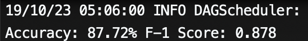
They are almost both 0.9!